Guide · Dashboards
SaaS Dashboard Design: Best Practices from Real Projects
What separates a dashboard users rely on from one they abandon? A practical guide to SaaS dashboard design, grounded in two real products I designed: Canary Beacon and Vipin.
SaaS dashboard design is one of the hardest disciplines in product design: you are condensing an entire system's health into a single screen that users check daily, often under pressure. Get the hierarchy wrong and critical alerts go unseen; get it right and the dashboard becomes the product's most valuable surface.
This guide shares the six dashboard design principles I apply in my own work, illustrated with screens from two projects: Canary Beacon, a real-time monitoring dashboard for mining operations, and Vipin, a location-based SaaS app I redesigned from the ground up. Both required the same core skills — data hierarchy, alert prioritization, navigation simplicity and a design system that scales.
Data hierarchy: surface what matters first
Great SaaS dashboard design is 90% prioritization. Users open a dashboard to answer a question in seconds — your layout decides whether they find the answer or drown in charts.
- —Place the single most important metric in the top-left of the viewport — the first place the eye lands in an F-pattern scan.
- —Group related metrics into panels so users can compare values without scrolling between distant cards.
- —Use size and contrast as rank signals: primary KPIs are large and bold, supporting stats are smaller and quieter.
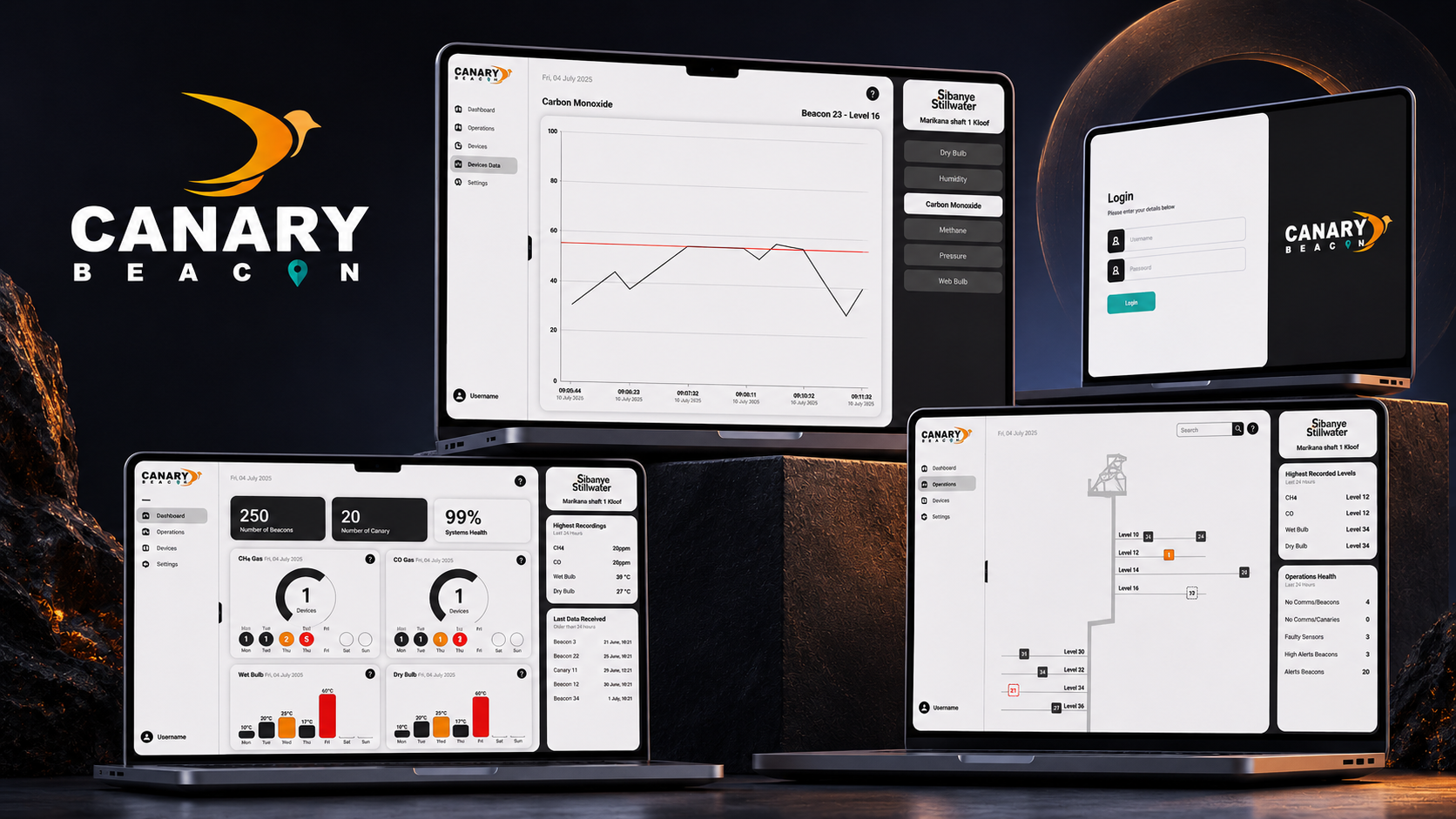
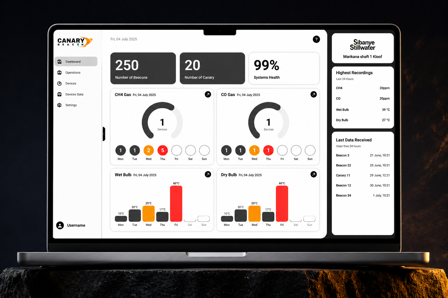
- —On the Canary Beacon mining dashboard, live environmental readings dominate the canvas while device status sits in a persistent side panel — critical data is never more than one glance away.
Alert prioritization and status color
Dashboards that monitor real systems live and die by their alerts. A clear alert hierarchy turns noise into signal and lets users act before a problem escalates.
- —Reserve red exclusively for critical, action-required states — if everything is red, nothing is.
- —Pair color with iconography and labels so alert states stay legible for color-blind users.
- —Sort alert feeds by severity and recency by default; let users mute acknowledged issues rather than delete them.
- —Canary Beacon uses high-contrast orange and teal accent tones against dark surfaces, so warnings cut through an otherwise calm, minimal interface.
Data visualization and readable reporting
Charts are the language of dashboards. The wrong chart type, an overloaded axis or a decorative gradient can make accurate data unreadable.
- —Match the chart to the question: line charts for trends over time, bars for comparisons, single-number cards for current state.
- —Label axes directly and avoid legends that force the eye to jump back and forth.
- —Use empty states that teach — a friendly 'No data yet, connect a device' beats a blank grey box.
- —The Canary Beacon carbon monoxide graph pairs a clean trend line with large current-value readouts, so operators see both the now and the trajectory at a glance.
A visual language built for long sessions
Dashboards are workspaces, not brochures. Users stare at them for hours, so the visual language has to reduce fatigue while still expressing the brand.
- —Dark surfaces with high-contrast accents reduce eye strain in control rooms and low-light environments.
- —Keep decoration out of the data layer — borders, shadows and gradients belong to chrome, never to charts.
- —A restrained palette (one primary, one or two accents, semantic status colors) scales across dozens of screens without drifting.
- —Both Canary Beacon (industrial orange/teal on deep surfaces) and Vipin (soft peach and violet accents on dark UI) show how brand personality can live in the accent layer while the data stays neutral and readable.
Design systems that scale with the product
A dashboard is never finished. New metrics, roles and modules arrive constantly — a component-based design system keeps every addition consistent without redesigning from scratch.
- —Define reusable card, panel, table and chart components with strict spacing and type rules.
- —Document states — loading, empty, error, permission-denied — for every component, not just the happy path.
- —Tokenize colors, spacing and typography so theme changes (like a dark/light mode toggle) propagate instantly.
- —On both projects, I delivered design-system direction alongside the screens, so future dashboard modules inherit the same visual hierarchy automatically.
Dashboard design case studies
The principles above come from hands-on product work. These screens are from Canary Beacon, an industrial monitoring platform where I led brand and dashboard design, and Vipin, a mobile SaaS app where I led the complete brand and UI/UX redesign.
Canary Beacon
Real-time monitoring dashboard for mining operations
Canary Beacon shows data hierarchy at its most demanding: operators underground need critical environmental readings, device status and alerts visible in one glance. Large data panels, high-contrast alert colors and simplified navigation keep the interface reliable under pressure.
View the Canary Beacon case study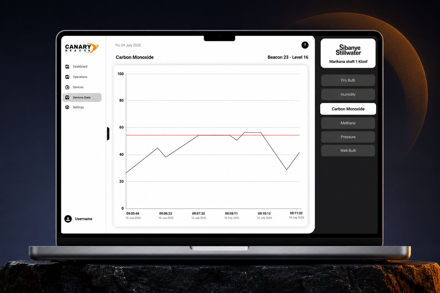
Canary Beacon — Reporting Graphs
Device data visualization
The carbon monoxide graph pairs a clean trend line with prominent current-value readouts. Operators see the live number and the trajectory together, without switching views — the reporting layout answers 'are we safe?' and 'which way is it moving?' simultaneously.
See the full dashboard system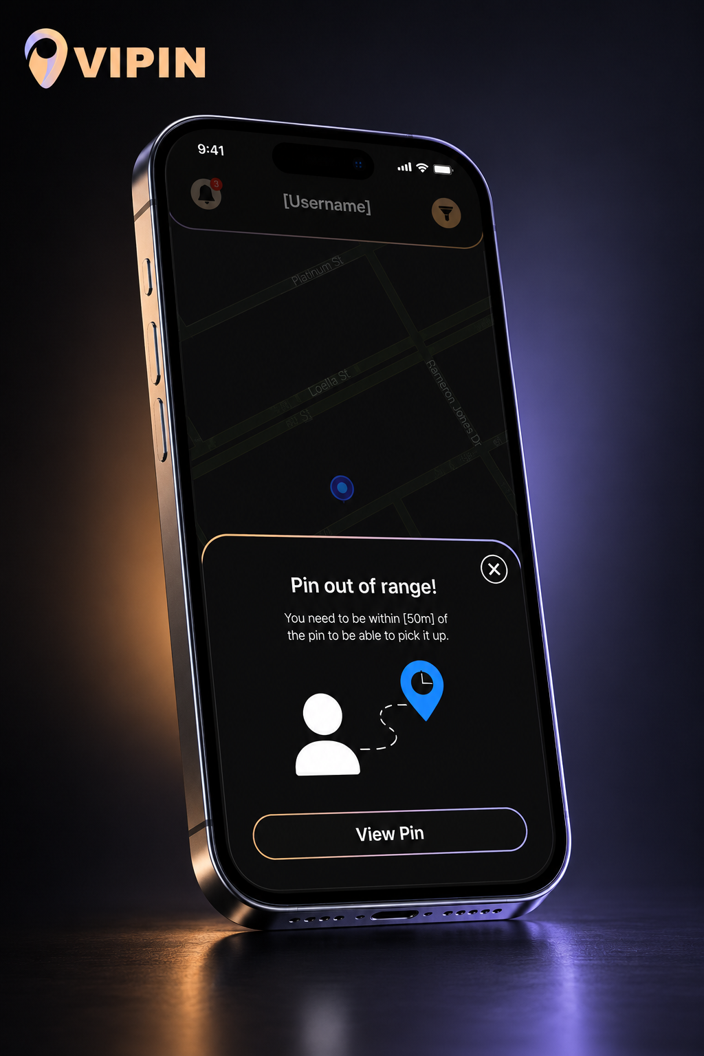
Vipin
Map-driven mobile SaaS experience
Vipin demonstrates navigation simplicity on mobile: one core map screen carries the whole product, while modals handle exceptions like 'pin out of range'. Dark UI with soft gradient accents keeps long sessions comfortable without sacrificing brand character.
View the Vipin case study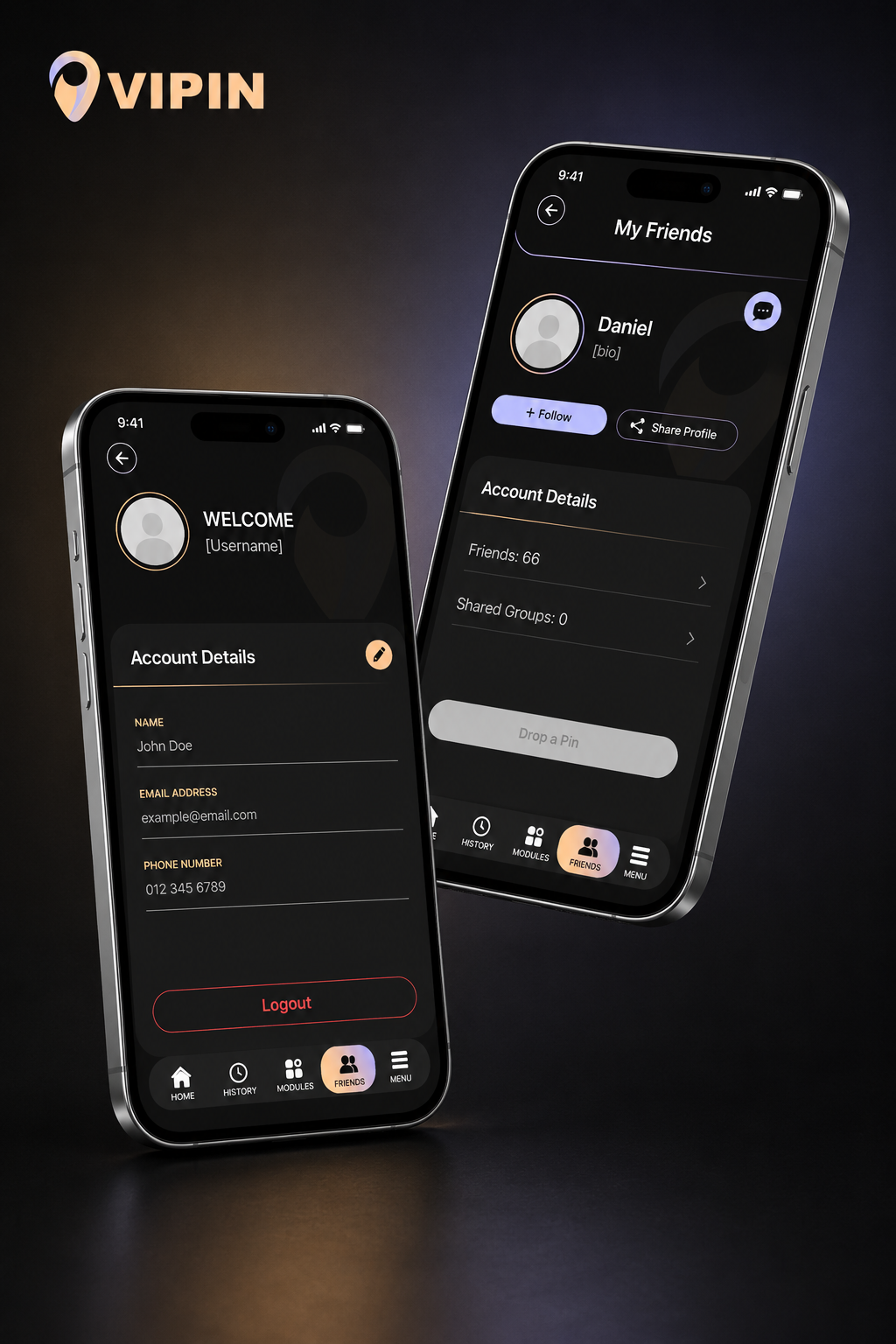
Vipin — Profile & Detail Screens
Secondary flows and account surfaces
Account details, friends and settings sit in consistent, minimal panels behind the primary map view. The same card language, spacing scale and accent palette carry across every screen — a design system doing its job quietly.
View the Vipin case studyDesigning dashboards users trust
Effective SaaS dashboard design is not about fitting more data on the screen — it is about making the right data impossible to miss. Clear data hierarchy, disciplined alert prioritization, simple navigation, honest data visualization and a scalable design system turn a dashboard from a reporting chore into a tool users depend on every day.
Whether you are building an industrial monitoring platform like Canary Beacon or a consumer-facing product like Vipin, start with the question your user opens the dashboard to answer — then design everything else around getting to that answer faster.
Need a SaaS dashboard design?
I design dashboard interfaces and design systems for SaaS and data-driven products.