Vipin — Brand & Mobile App
Overview
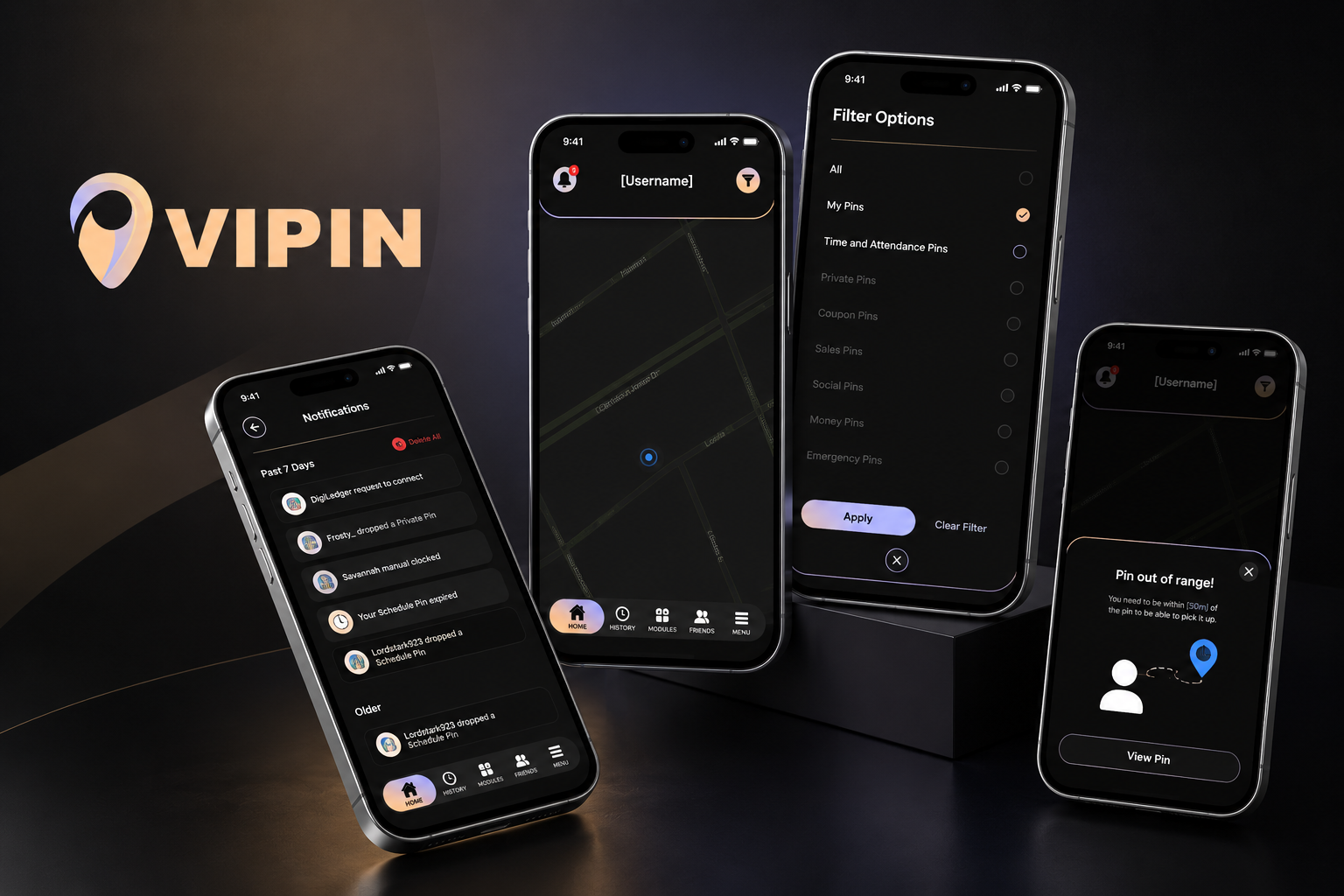
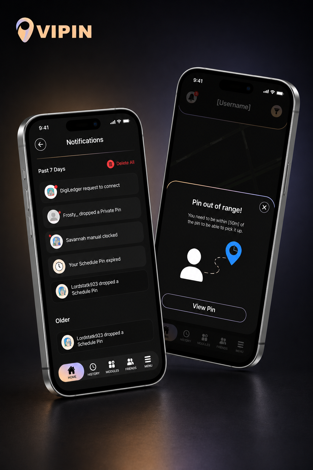
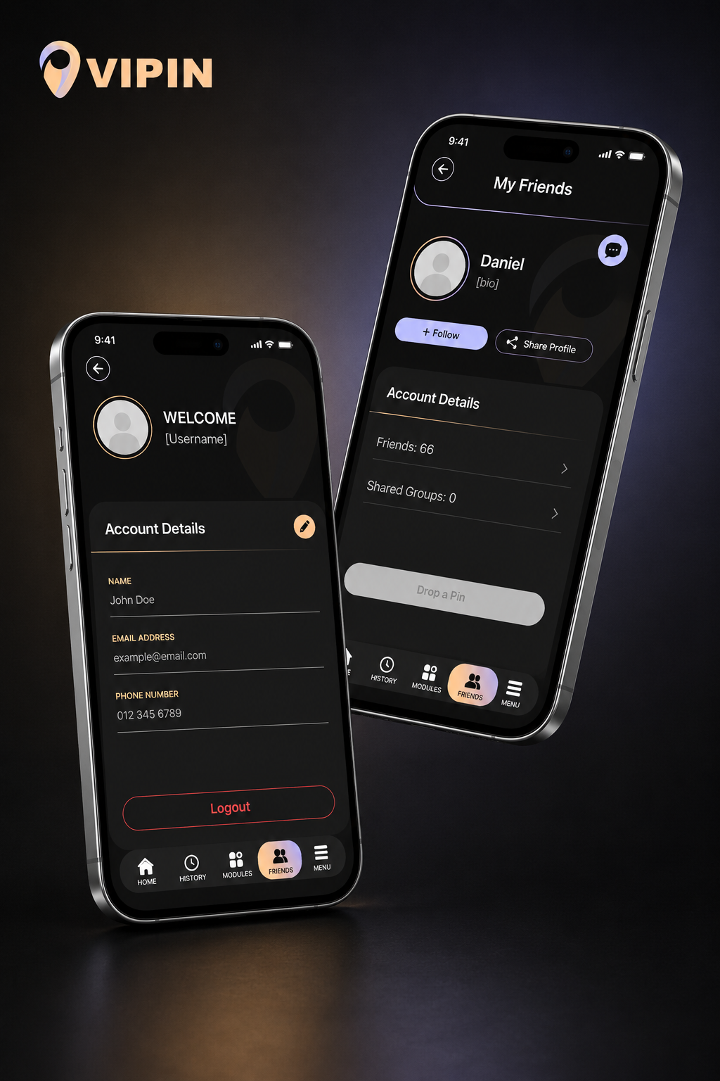
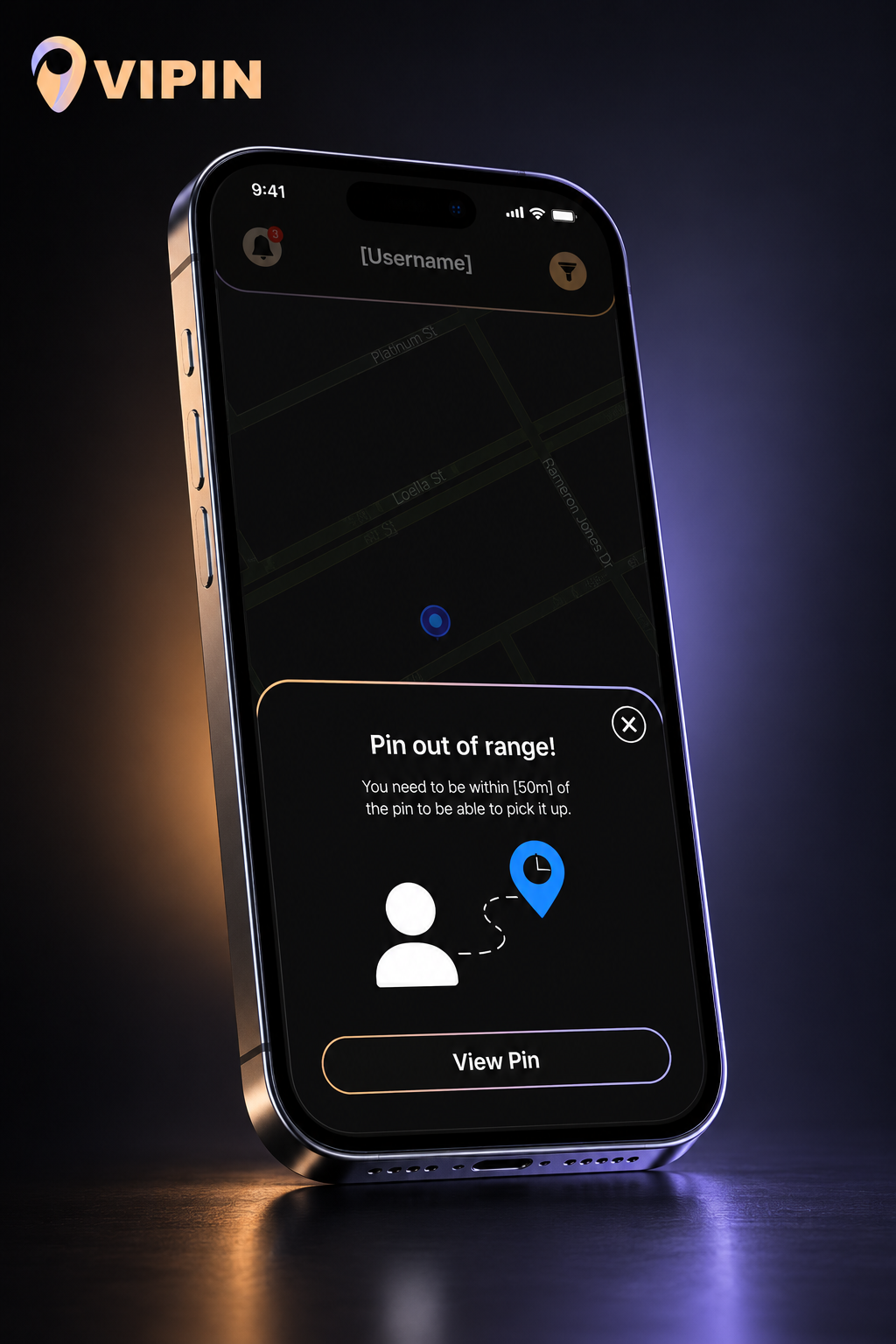
VIPIN is a modern location-based mobile application focused on real-time interaction, pin sharing, notifications, and social connectivity through an intuitive map-driven experience.
When the project was initially brought to me, the existing interface lacked visual consistency, clear user flow, and overall usability. The objective was not only to modernize the application visually, but to completely rethink the user experience from the ground up while creating a stronger and more scalable brand identity.
My role involved leading the complete brand redesign and helping shape the product into a more polished, user-friendly, and commercially viable experience.
My Contributions
Design Approach
The redesign focused heavily on clarity, accessibility, and interaction flow while maintaining a sleek, modern aesthetic. Dark UI styling combined with soft gradient accents helped create a premium visual identity that feels both professional and approachable.
Every screen was redesigned with usability in mind — simplifying navigation, improving hierarchy, reducing visual clutter, and creating a more cohesive experience across the entire application.
The updated branding system was designed to support future scalability while giving the app a distinct and recognizable identity.
Visual Direction
The visual language combines:
- Dark immersive interfaces
- Soft peach and violet accent gradients
- Minimalist UI components
- Clean typography
- High contrast layouts
- Modern floating device presentations
The result is a more refined product experience that balances functionality with strong visual appeal.
Brand Identity
Color Palette
Project Display
Outcome
The redesign transformed VIPIN from an inconsistent concept into a much more polished and cohesive product experience. By reworking both the branding and interface system, the app now presents a clearer identity, improved usability, and a stronger foundation for future development.