Arasoft — Logo & Packaging
Arasoft is a tissue and hygiene brand focused on creating visually distinctive, retail-ready packaging across multiple product ranges. The project included logo design, packaging system development, colour differentiation, and shelf-ready branding for multiple variants.
Brand Identity
A modern, recognisable retail mark.
The identity was designed to feel modern, clean, and easily recognisable on retail shelves. The circular emblem and leaf icon represent softness, freshness, and everyday comfort while remaining versatile across multiple packaging categories.
Colour Palette
Magenta
#e91e8c
Royal Purple
#6a2c91
Orange
#f59522
Navy
#0d1f4a
Sky Blue
#1b9cd6
Light Green
#7ab83a
Forest Green
#2f6e2a
Soft White
#ffffff
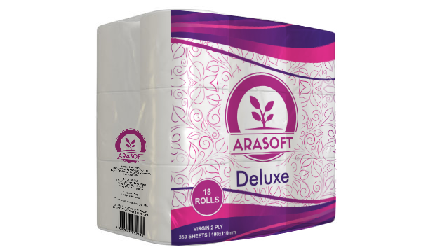
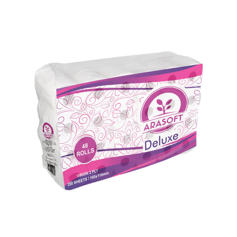
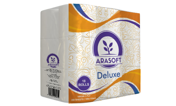
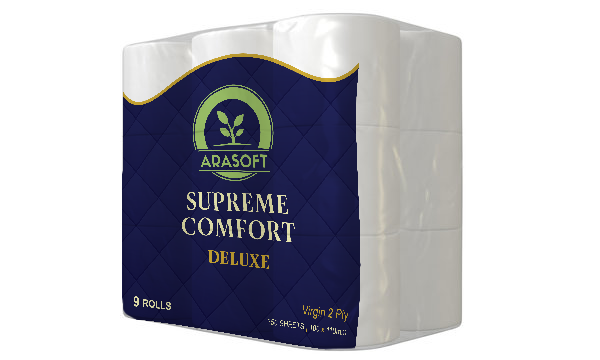
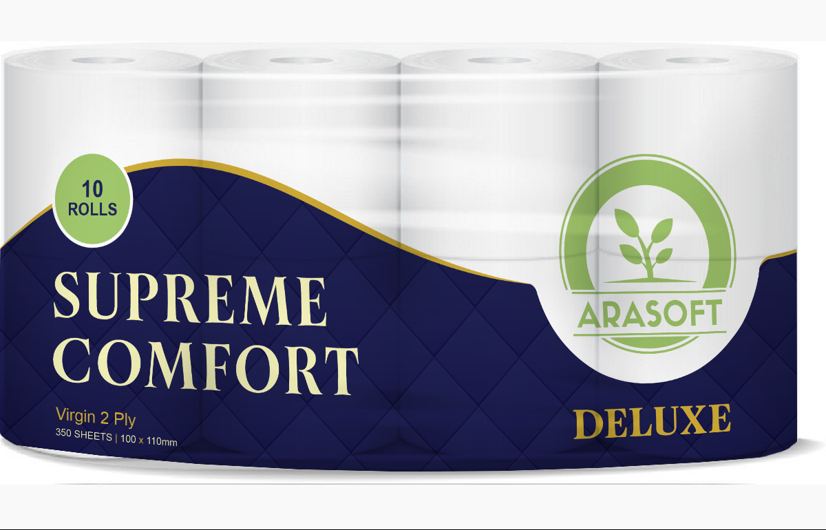
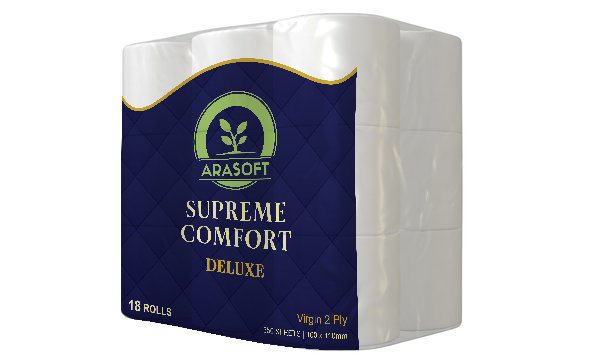
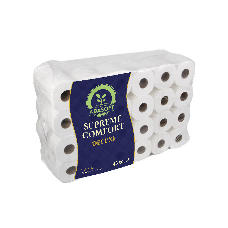
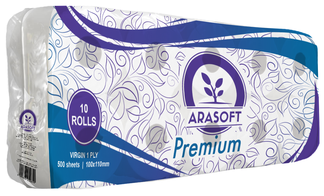
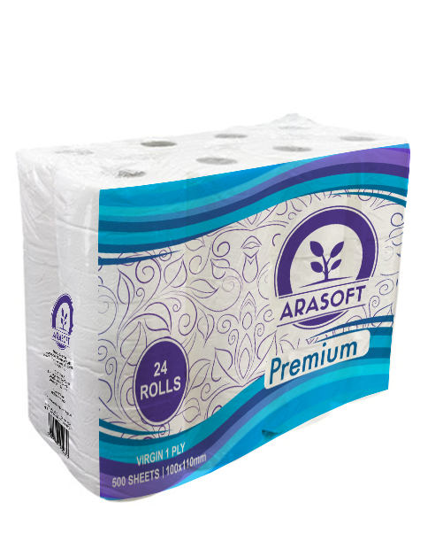
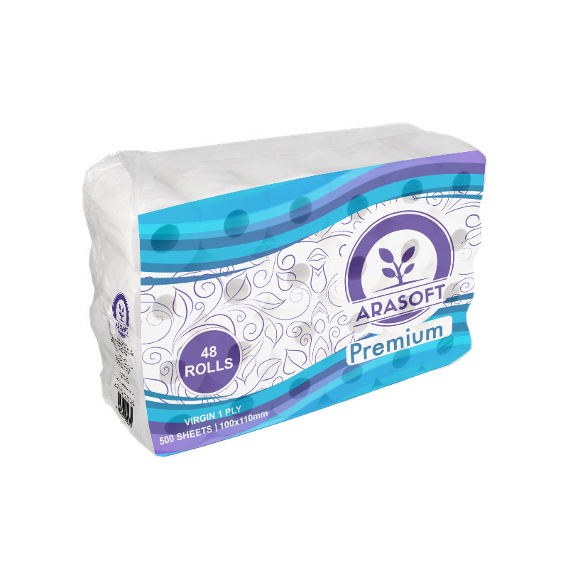
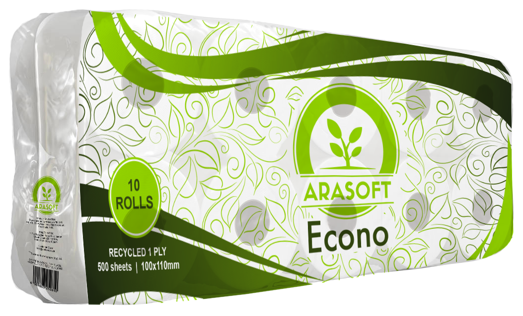
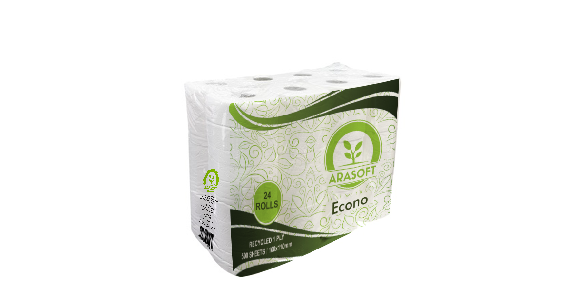
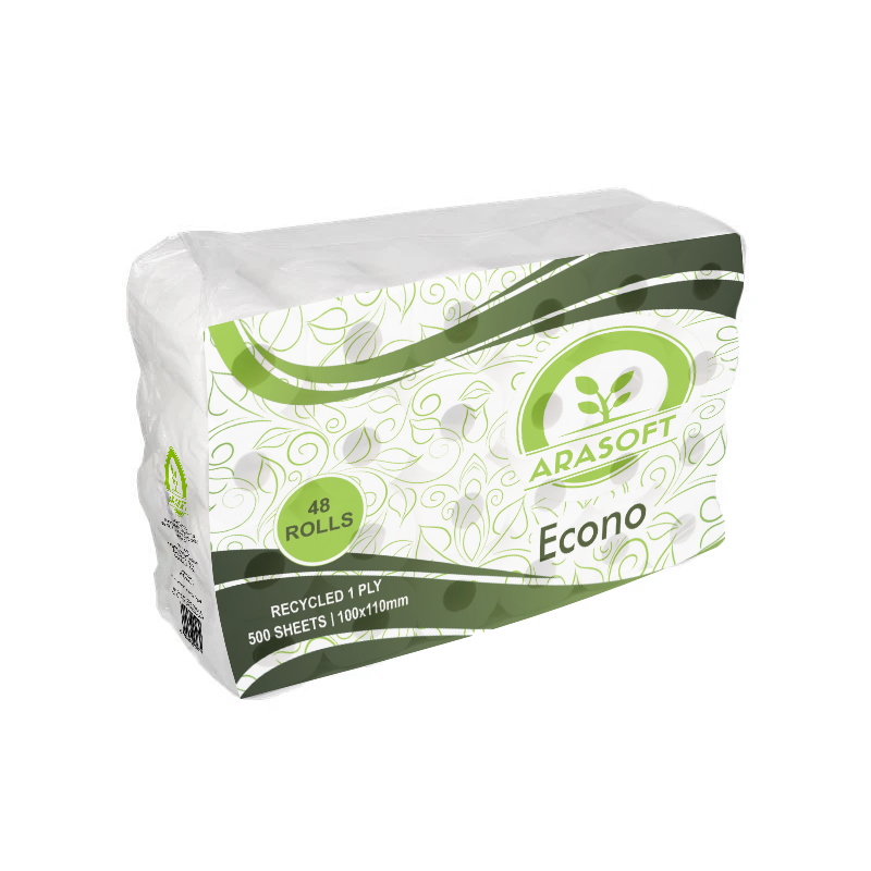
Packaging System
Four ranges. One coherent system.
A scalable packaging system was developed to differentiate each product range while maintaining strong brand consistency. Each variant uses its own colour palette, wave pattern styling, and hierarchy structure to improve shelf visibility and customer recognition.
Arasoft
Deluxe
3 Ply

Arasoft
Supreme Comfort
Virgin 2 Ply · 350 Sheets
Arasoft
Premium
Virgin 1 Ply · 500 Sheets
Arasoft
Econo
Recycled 1 Ply · 500 Sheets
Results
The final packaging system successfully established a cohesive visual identity across multiple product categories while allowing each range to maintain its own unique personality and retail appeal.