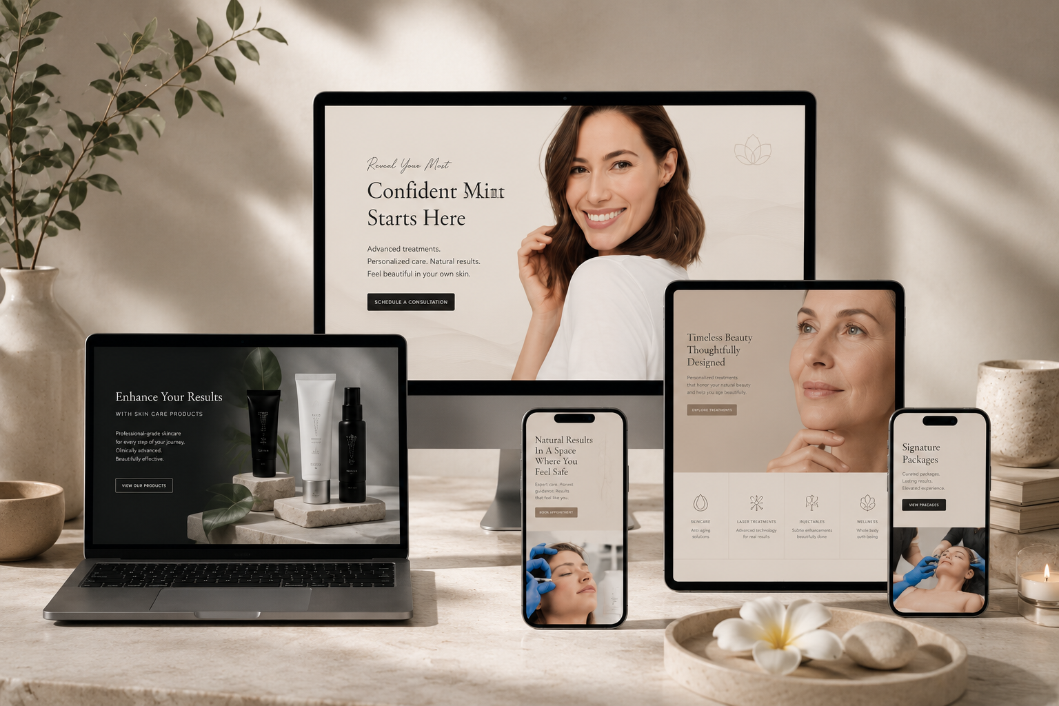
Inspiration · Brand Identity
Top Medspa Brand Identity Inspiration
Six medspa branding styles compared side by side — palettes, typography, the signal each one sends, and the trade-off that comes with it.
Most medspa brand identity work fails in the same way: it copies the aesthetic of whichever competitor looks most expensive, without asking what that aesthetic actually promises the client. An editorial serif brand and a modern clinical brand can offer identical treatments and attract completely different people.
This is a curated gallery of six directions from my own MedSpa Website Collection, compared rather than simply displayed. For each style you get the palette, the typographic system, who it is right for, and — the part most inspiration galleries skip — what it costs you.
Editorial Serif — Prism
Quiet luxury, considered, magazine-like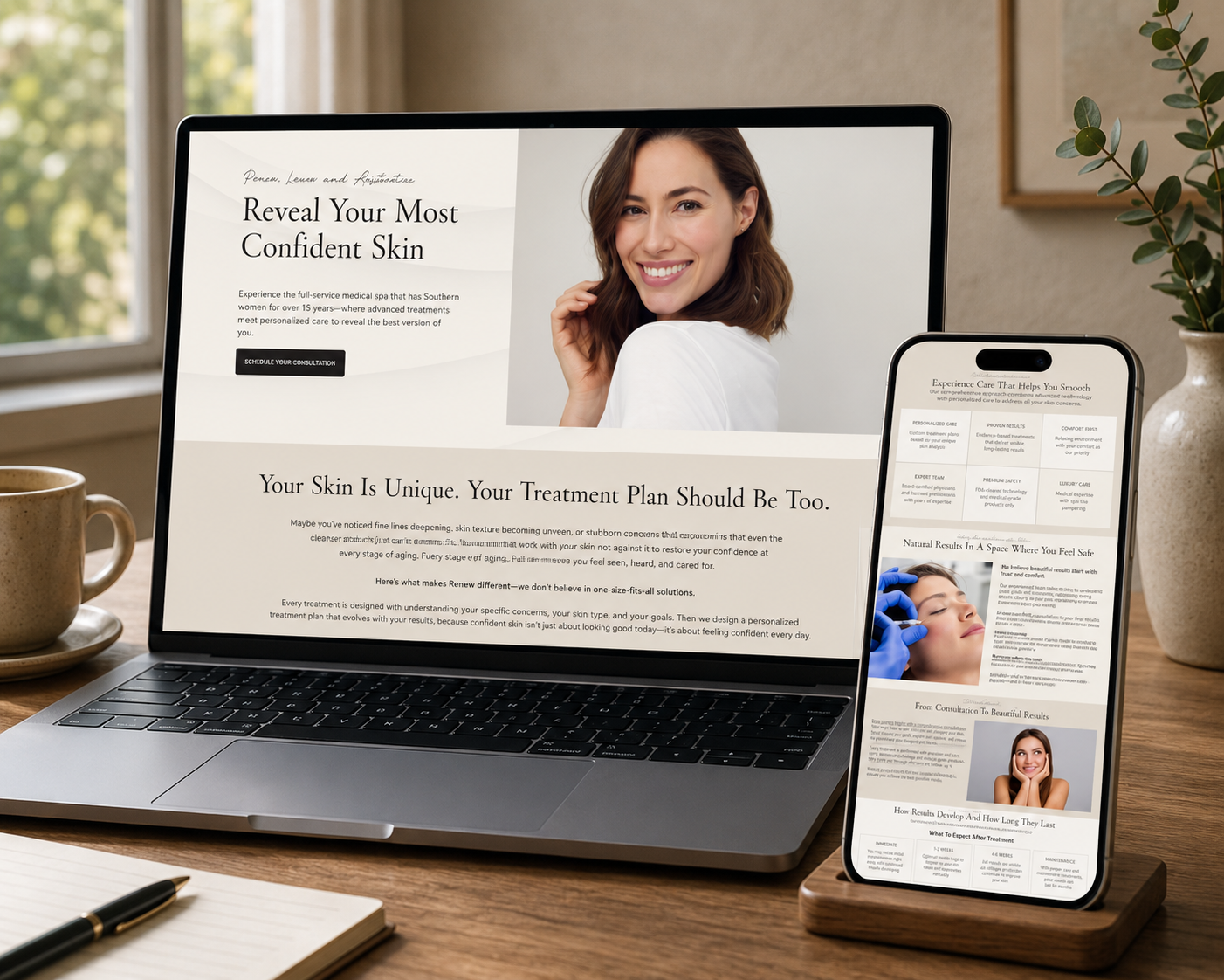
Editorial serif identities borrow their confidence from print. Warm neutrals and generous whitespace slow the eye down, while a high-contrast serif display carries the entire brand voice with almost no ornament. The script eyebrow is the only decorative element — used once, it reads as a signature rather than as decoration.
- Typography:
- Bellefair · Anantha Signature · Open Sans
- Best for:
- Boutique medspas selling bespoke, consultation-led treatments where the client is buying taste as much as results.
- Trade-off:
- Reads as expensive, but can feel cool or distant if the copy is not warm. Needs excellent photography to hold up.
Dark Editorial Glam — Pretty Girl
After-dark, glamorous, unapologetically feminine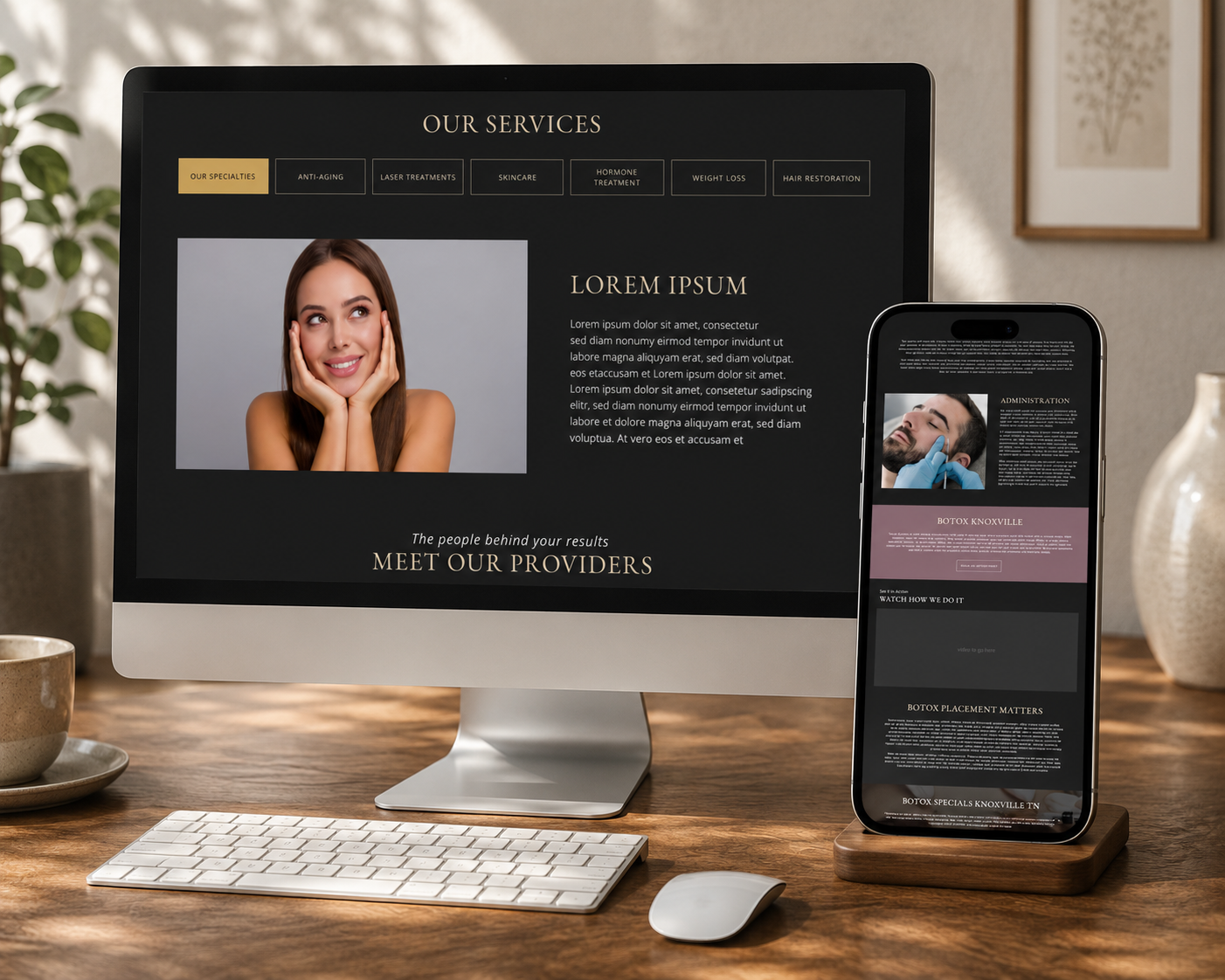
Dark identities are rare in the medspa space, which is exactly why they cut through. Deep black grounds the brand, mauve softens it so it never turns severe, and antique gold supplies the luxury cue that white space provides in lighter systems. A classical Garamond keeps it editorial instead of nightclub.
- Typography:
- EB Garamond · Open Sans Italic
- Best for:
- Medspas positioned around beauty and transformation rather than clinical wellness — lash, filler, body contouring and event-led practices.
- Trade-off:
- Contrast and legibility need constant policing, and dark UI raises the bar for image quality and retouching.
Modern Clinical — Defy
Precise, results-driven, medically credible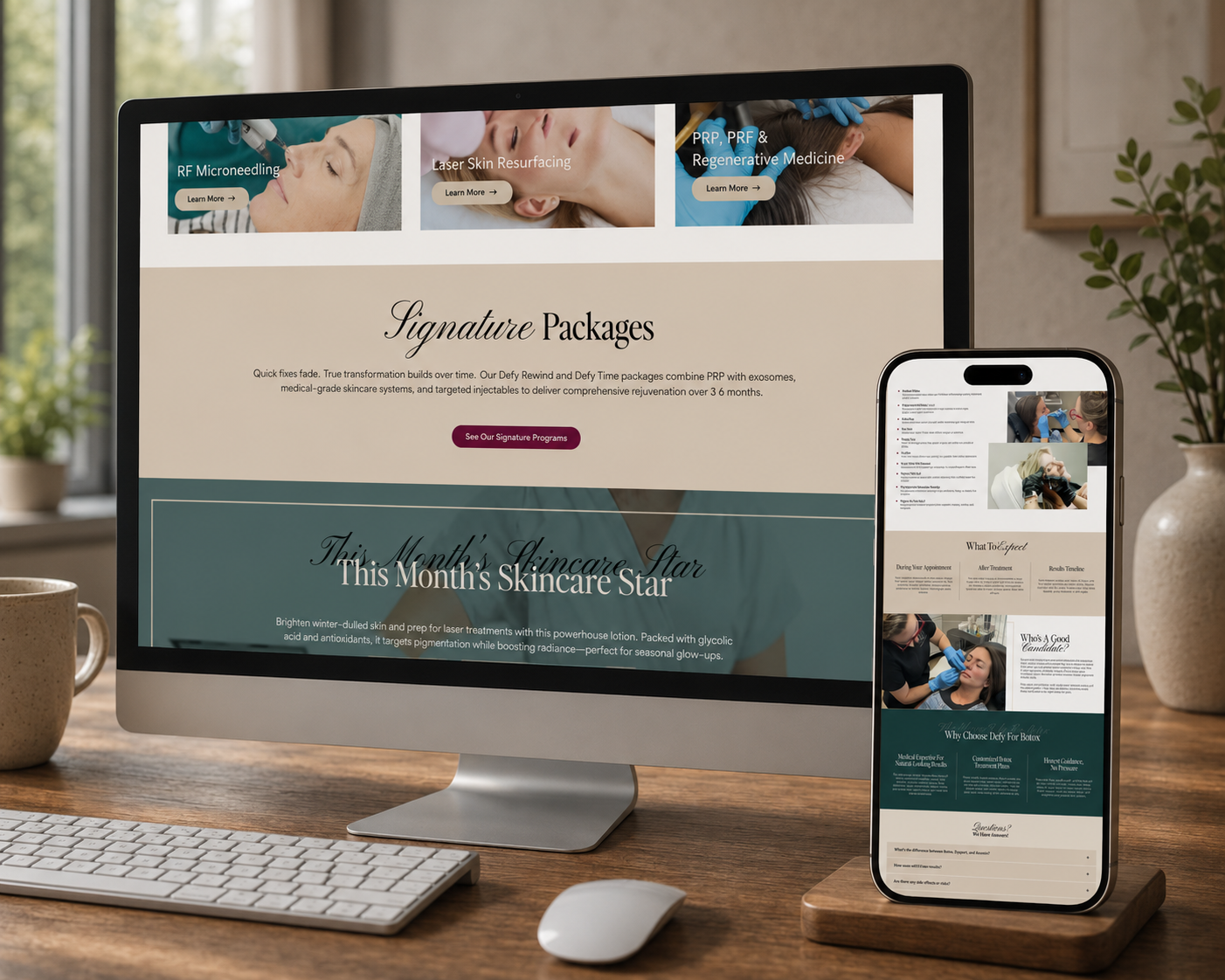
Modern clinical identities trade warmth for authority. Cool greys and a deep navy accent echo medical design language without the sterility of pure hospital white, and tight, grid-led layouts imply precision. The restraint is the message: nothing here is trying to distract you from the results.
- Typography:
- Modern serif display · geometric sans body
- Best for:
- Practices led by a physician or nurse injector where credentials, technology and measurable outcomes are the sell.
- Trade-off:
- Easy to slip into generic tech-startup territory. The identity lives or dies on typographic detail and photography direction.
Soft Boutique — Privvy
Intimate, discreet, personal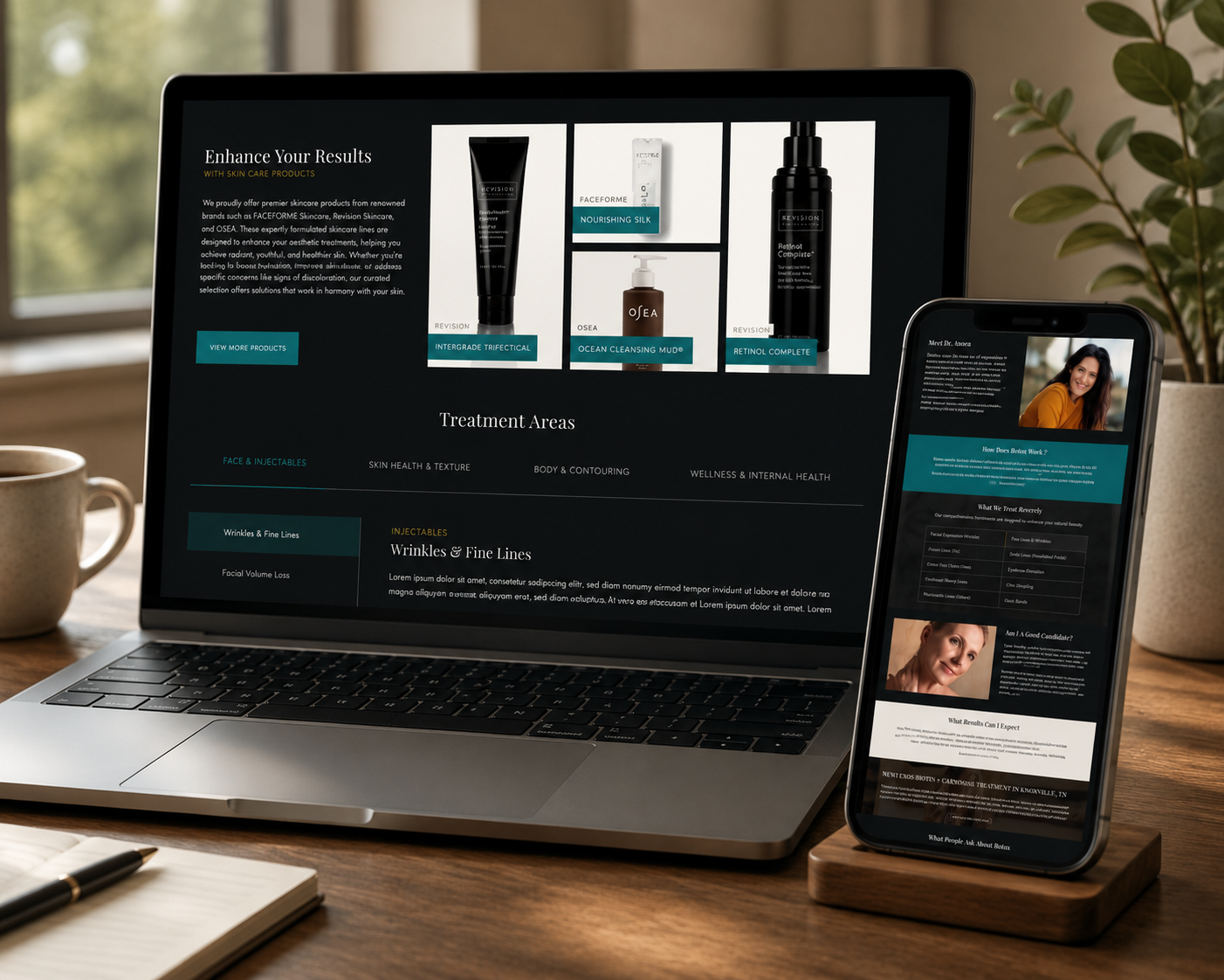
Blush-led identities communicate intimacy faster than any headline can. Muted gold keeps the softness from tipping into juvenile, and delicate type sizing signals that the brand is speaking to one person rather than broadcasting. Layouts stay narrow and calm on purpose.
- Typography:
- Editorial serif · geometric sans
- Best for:
- Small, appointment-only medspas where privacy and one-to-one attention are the differentiator.
- Trade-off:
- Blush palettes skew heavily feminine and can narrow the audience. Contrast ratios need care on ivory backgrounds.
Botanical Wellness — Revel
Restorative, natural, holistic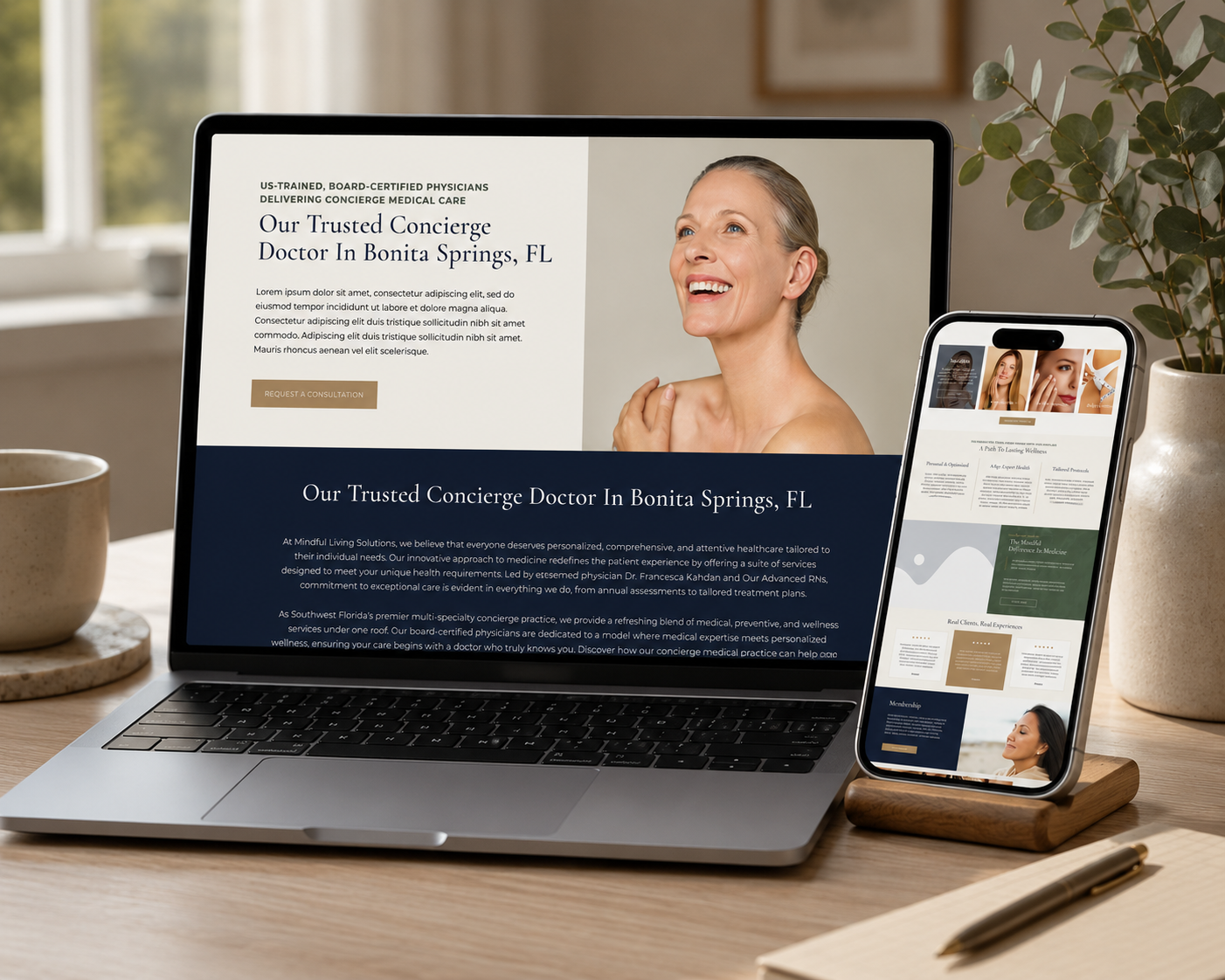
Sage and cream do the strategic work of positioning a clinical service as a wellness ritual. This style is the natural home for brands whose treatments are ongoing rather than one-off, because the palette suggests maintenance and renewal rather than dramatic before-and-after change.
- Typography:
- Nature-inspired serif · clean sans body
- Best for:
- Medspas bridging aesthetics and wellness — IV therapy, longevity, skin health and recovery-led services.
- Trade-off:
- Green-led systems risk reading as organic skincare rather than medical. Anchor with clinical credentials to keep credibility.
Warm Minimal — Thrive
Approachable, energetic, premium without pretension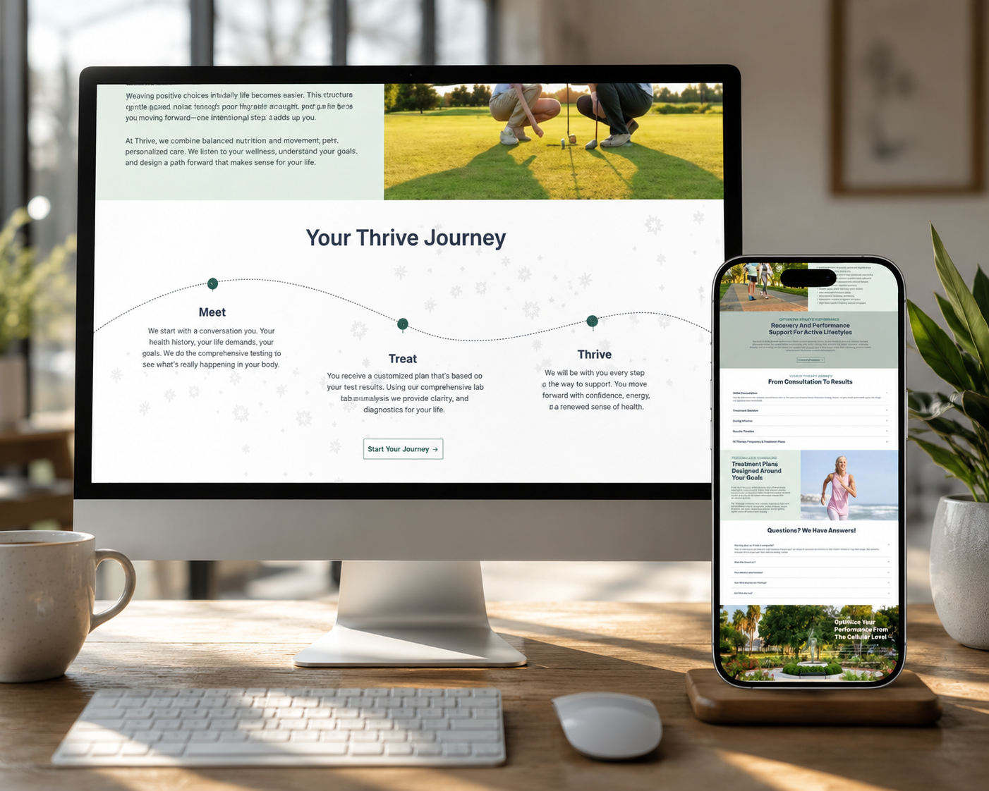
Terracotta is the most under-used accent in medspa branding. It carries the warmth of a hospitality brand while the sand and warm-white base keeps the system minimal enough to feel premium. This is the most forgiving style of the six — it photographs well, scales across social, and welcomes rather than filters.
- Typography:
- Display serif · accessible sans
- Best for:
- Growing medspas that need broad local appeal and cannot afford to feel intimidating to first-time clients.
- Trade-off:
- Warmth can undercut a luxury price point if the typography and spacing are not disciplined.
Side-by-side comparison
The fastest way to narrow six medspa design ideas down to one: decide which signal your practice most needs to send, then accept the risk that comes with it.
| Style | Primary signal | Main risk | Right audience |
|---|---|---|---|
| Editorial Serif | Taste | Feels distant | Bespoke, consultation-led |
| Dark Editorial Glam | Desire | Legibility | Beauty-led transformation |
| Modern Clinical | Authority | Generic tech | Physician-led results |
| Soft Boutique | Intimacy | Narrow appeal | Private, appointment-only |
| Botanical Wellness | Restoration | Reads non-medical | Longevity and skin health |
| Warm Minimal | Welcome | Under-premium | Broad local growth |
How to choose your medspa brand direction
- —Start with your highest-margin treatment, not your full menu. The brand should look like the thing you most want to sell.
- —Decide whether you are selling transformation or maintenance — the first rewards editorial and glam directions, the second rewards botanical and clinical ones.
- —Check your photography honestly. Dark editorial and editorial serif systems collapse without strong imagery; warm minimal is far more forgiving.
- —Pick the accent colour last. A single disciplined accent across an otherwise neutral system does more for perceived luxury than a broad palette ever will.
- —Pressure-test the identity at small sizes and on social before signing off — most medspa brand touchpoints are a phone screen, not a lobby wall.
Once the identity direction is settled, the web design decisions get much easier. I break those down in my companion guide on the best medspa website design trends for 2025, which covers palettes, typography, trust-first UX and mobile booking journeys in depth.
Need a medspa brand identity?
I build complete identity systems — logo, palette, typography and web — for aesthetic and wellness brands.